


Marxfoods.com is an e-commerce store founded in 2007 to give ambitious home chefs and restaurants alike access to some of the worlds finest foods. In addition to designing every previous iteration, I recently spearheaded the 7th version of the site which was the first one to include a complete technical and visual overhaul utilizing responsive design with a mobile first development process.
Role: Creative Director/Product Design Lead
Marxfoods.com was started as a small startup and initial limiting technological decisions were made that kept the entire site non-responsive long past when it should have changed. The product catalog had grown to 1,500 + products, with the Marx consumer sites garnering millions of yearly visitors, a growing percentage of which was coming through on mobile devices. The challenge was to use as much existing content as possible and design a completely new site that starts mobile first, retaining our unique brand, and continuing to serve our existing customers while better serving new users.
With the site being one of 3 divisions encompassing over a dozen sub-brands, it was important to take stock of the core site ecosystem along with the wider relationships.
Being a redevelopment of an existing site, I had the advantage of multitudes of user information. With year over year analytics data, user survey feedback with hundred’s of relevant responses to run choice models on, and direct access to the service and operations team members first hand experiences helping customer pain points, the main goals were obvious from the start. Our user base was getting younger and more mobile, but due to a non-responsive site, we were not converting on mobile devices.
After exhaustively researching our immediate competitive landscape, there wasn’t an immediate sample with a large and varied set of products serving the same shopping intent. So the field was widened to relevant industries, most notably fashion where faceted search navigation is commonly used to allow the user to curate their own product displays along with company specified listings. Stakeholders were on board, and I continued the design around a search and response faceted URL product catalog system.
To accommodate the related content associated with each product, I chose to utilize push panes to give the user the choice of expanding without it requiring extra scroll. This keeps the most important items front and center while allowing a more thorough review in a smaller less cluttered space.
Multiple shopping flows and navigation structures were developed in order to serve different goals. While nestling the shopping pages within their own hub elevated the related content, it added extra levels of click through before getting to the product information pages. Knowing that most visitors came with the intent to purchase along with the company goal of selling goods, the decision was made to focus top level hierarchy and navigation on category level pages getting users to their intended pages earlier, as well as presenting the full product line.
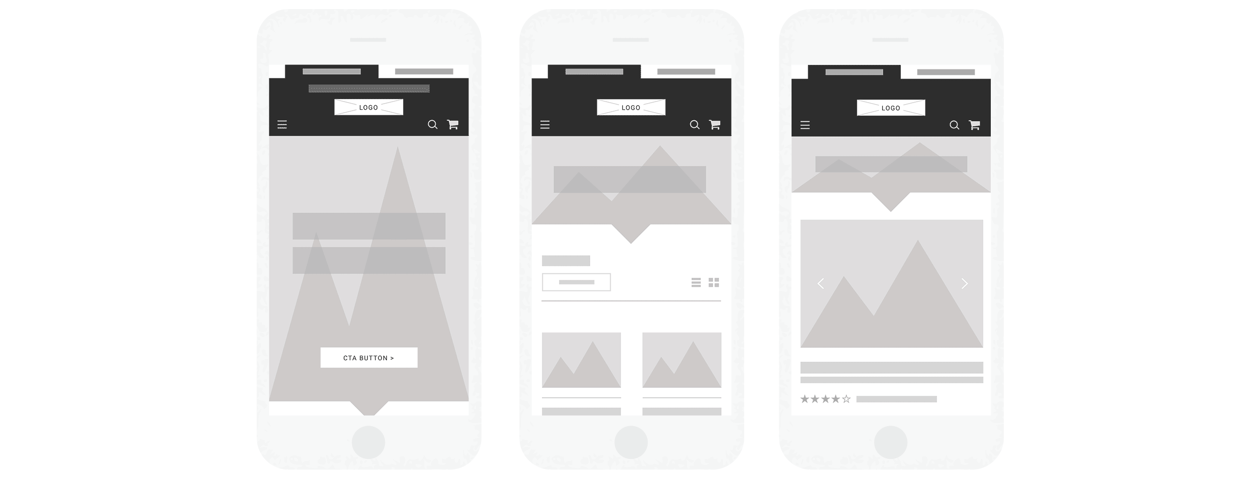
With user data in hand and a thorough understanding of the features we wanted to include, the project moved onto the stacks of paper and sharpie stage. Without being able to erase we were able to clearly finish each thought and keep drawing to conclusion, eventually landing on just the right basic feel. At this stage I was able to work through the varying levels of content, eventually designing a blocking system where the content could be added as needed while never feeling forced.
With basic sketches in hand, I took them into wire blocking to get a general flow and feel through multiple rounds of testing and approval. This round helped to solidify the modular content blocking to assure that information and purpose is easily accessible, no matter the length of the page.
While the focus was mobile first, the site was designed fully at multiple break points to provide optimal viewing from any device.
Once pacing and blocking was in place and settled, another high fidelity round was designed to finesse the colors and design. With stakeholder approval in hand, I took it directly into prototyping in a local server account using HTML5, CSS3 and JavaScript, Bootstrap, Backbone and SASS.
With thousands of products and pages, prototyping in a design program wasn’t going to let us test the full user experience. With a full working database to work with on the back end, I utilized local hosting of the working front end code. While changes and iterations required more work between, it allowed me fully test the flows and experiences with a sample base of users.
With constant A/B testing, multiple user surveys, and analyzing user flows, the site has received a steady stream of improvements resulting in measured success for both the company and customers.
While the redevelopment was a success at meeting its goals, the added traffic and pages viewed did not translate into a higher conversion rate. I had succeeded in giving more immediate options to the user without adding context, effectively making it harder to make a sales decision.
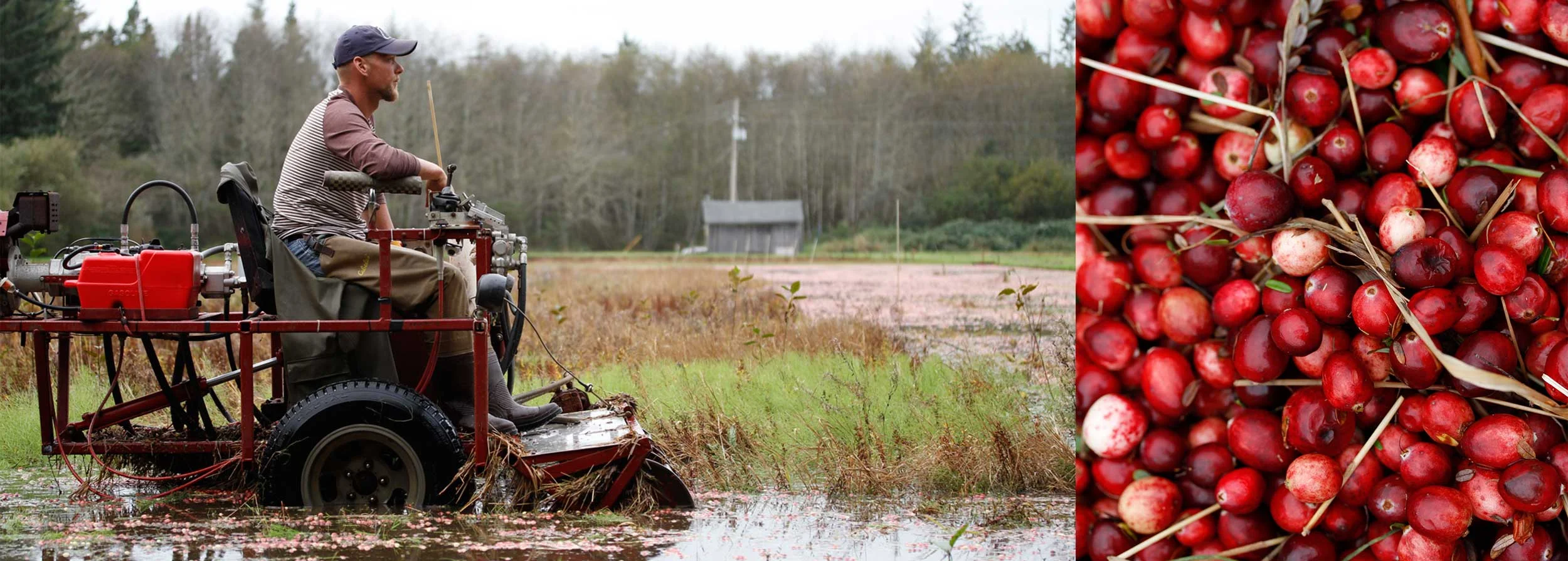
With this in mind, I lead the team in developing a sourcing and test kitchen series covering new, popular or up and coming products to provide a compelling, empowering guide to the ins and outs along with multiple preparations. These product curations along with multi level content and links led to recent record sales months.
The message? “We fail so you don’t have to.”
With hundreds of shoots both locally in studio and abroad, I lead planning and directing with teams of creatives to produce several series of videos. We highlighted producers, provided techniques and recipes, as well as created enticing lifestyle advertising.